9 Descriptive Statistics: Categorical
For this section we use the Titanic data set. The lines below imports into R the data and converts some of the variables to factors.
titanic2 <-
    haven::read_dta("./Data/titanic2.dta") %>%
    mutate(sex  = haven::as_factor(sex),
           died = haven::as_factor(died),
           age  = haven::as_factor(age),
           class = haven::as_factor(class)) %>%
    haven::zap_labels()
We begin by visualizing the first 6 rows of the data
titanic2 %>% head()| class | age | sex | died |
|---|---|---|---|
| first | adult | male | No |
| first | adult | male | No |
| first | adult | male | No |
| first | adult | male | No |
| first | adult | male | No |
| first | adult | male | No |
And then summarize the entire data
titanic2 %>% summary()
    class        age           sex        died
 first :325   child: 109   female: 470   No : 711
 second:285   adult:2092   male  :1731   Yes:1490
 third :706
 crew  :885
9.1 Single Categorical Variable
9.1.1 Frequencies & Proportions
The most common modality for presenting a single categorical variables is tabulating the observations, and subsequently expressing these frequencies as proportions or percentages. This is done below
titanic2 %>%
    gtsummary::tbl_summary(
        include = class,
        digits = class ~ c(0,1)
    ) %>%
gtsummary::bold_labels()| Characteristic | N = 2,2011 |
|---|---|
| Passenger's cabin class | |
| first | 325 (14.8%) |
| second | 285 (12.9%) |
| third | 706 (32.1%) |
| crew | 885 (40.2%) |
| 1 n (%) | |
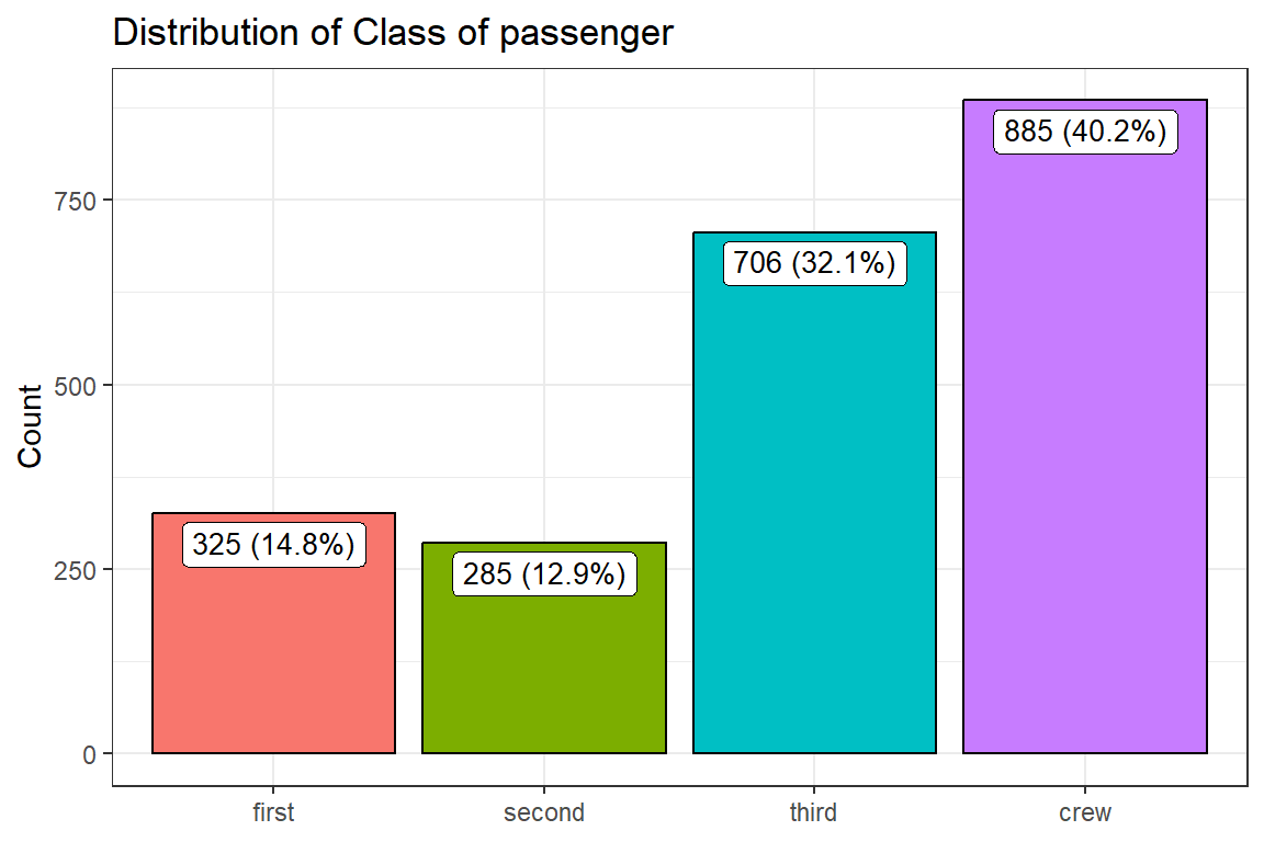
9.1.2 Graph - Barchart
We first summarize the data
bar_data <-
    titanic2 %>%
    drop_na(class) %>%
    count(class) %>%
    mutate(perc = `n` / sum(`n`)) %>%
    arrange(perc) %>%
    mutate(labels = paste(n, " (", scales::percent(perc), ")", sep=""))

bar_data| class | n | perc | labels |
|---|---|---|---|
| second | 285 | 0.129 | 285 (12.9%) |
| first | 325 | 0.148 | 325 (14.8%) |
| third | 706 | 0.321 | 706 (32.1%) |
| crew | 885 | 0.402 | 885 (40.2%) |
And the plot the barplot
bar_data %>%
    ggplot() +
    geom_bar(stat = "identity",
             aes(y = n, x = class, fill = class),
             col = "black",
             show.legend = F) +
    geom_label(aes(y = n, label = labels, x = class),
               vjust = 1.2,
               show.legend = FALSE, size=3.5) +
    labs(x = NULL,
         y = "Count",
         title = "Distribution of Class of passenger") +
    theme_bw()
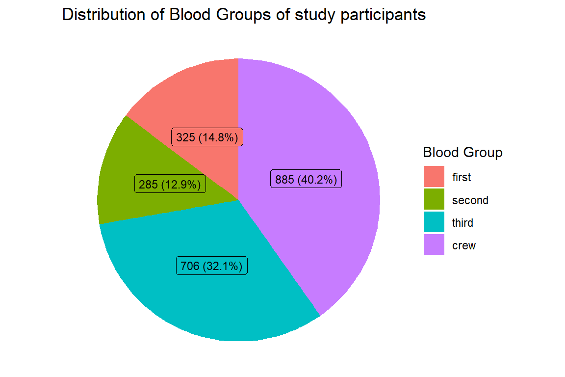
9.1.2.1 Pie Chart
To do this we use the previously summarized data. Then we draw a customised Pie Chart
bar_data %>%
    ggplot(aes(x = "", y = perc, fill = class)) +
    geom_col() +
    geom_label(aes(label = labels),
               position = position_stack(vjust = 0.5),
               show.legend = FALSE, size =3) +
    coord_polar(theta = "y", start=0) +
    labs(title = "Distribution of Blood Groups of study participants",
         fill = "Blood Group") +
    theme_void()
9.1.3 Two categorical Variables
9.1.3.1 Frequencies & Proportions
titanic2 %>%
    tbl_cross(row = sex, col = died) %>%
bold_labels()| Died at sea | Total | ||
|---|---|---|---|
| No | Yes | ||
| Sex of passenger | |||
| female | 344 | 126 | 470 |
| male | 367 | 1,364 | 1,731 |
| Total | 711 | 1,490 | 2,201 |
9.1.3.2 Row percentages
titanic2 %>%
    tbl_cross(row = sex, col = died, percent = "row", digits = c(0,1)) %>%
bold_labels()| Died at sea | Total | ||
|---|---|---|---|
| No | Yes | ||
| Sex of passenger | |||
| female | 344 (73.2%) | 126 (26.8%) | 470 (100.0%) |
| male | 367 (21.2%) | 1,364 (78.8%) | 1,731 (100.0%) |
| Total | 711 (32.3%) | 1,490 (67.7%) | 2,201 (100.0%) |
9.1.3.3 Column percentages
titanic2 %>%
    tbl_cross(row = sex, col = died, percent = "col", digits = c(0,1)) %>%
bold_labels()| Died at sea | Total | ||
|---|---|---|---|
| No | Yes | ||
| Sex of passenger | |||
| female | 344 (48.4%) | 126 (8.5%) | 470 (21.4%) |
| male | 367 (51.6%) | 1,364 (91.5%) | 1,731 (78.6%) |
| Total | 711 (100.0%) | 1,490 (100.0%) | 2,201 (100.0%) |
9.1.3.4 Table Total Percentages
titanic2 %>%
    tbl_cross(
        row = sex,
        col = died,
        percent = c("cell"),
        digits = c(0,1)) %>%
bold_labels()| Died at sea | Total | ||
|---|---|---|---|
| No | Yes | ||
| Sex of passenger | |||
| female | 344 (15.6%) | 126 (5.7%) | 470 (21.4%) |
| male | 367 (16.7%) | 1,364 (62.0%) | 1,731 (78.6%) |
| Total | 711 (32.3%) | 1,490 (67.7%) | 2,201 (100.0%) |
